A Small Courtyard Palette Built from Three Colours
Plan a small courtyard color palette by assigning three hues to foliage, flowers, and surfaces, so each layer feels connected without looking crowded.
At breakfast, a terracotta pot, a blue-gray wall, and a flush of yellow flowers can all look lovely on their own—and oddly jumbled together. A small courtyard color palette gives those competing details a shared plan. The useful trick is to treat foliage, flowers, and surfaces as separate visual layers, then decide how three colors will relate before buying plants or paint.
Think of the palette as a boundary, not a demand that every leaf and bloom match. Green foliage can remain the garden’s visual background, while three chosen colors guide the eye across pots, flowers, furniture, and walls. A week is enough to make the decisions thoughtfully, provided you look at the courtyard in its actual light and keep a little room for plants to be plants.
What should the three colors do?
Give each color a job. One should anchor the courtyard, one should provide a supporting note, and one should act as an accent. The anchor is usually the color with the greatest presence: perhaps a painted wall, paving, a large planter, or the dominant tone of the foliage. The supporting color repeats in smaller areas. The accent appears sparingly, often in flowers or one portable object.
These roles do not have to match a strict design formula. A sheltered courtyard with a dark green hedge might use deep green as its anchor, soft cream as its support, and coral as its accent. A sunlit space with pale paving could instead use warm stone, blue-green foliage, and a small note of violet. The three colors are the deliberate choices; ordinary variations in leaves, soil, bark, and bloom remain part of the scene.
Start by looking at what is already fixed. Paving, brick, fencing, and the house wall can occupy a large share of a courtyard, so their color may already be doing the anchoring. Do not choose a new palette as if these surfaces were blank. Write down the fixed colors you can see from the doorway and from the main seat. If one of them is strong, make it part of the plan rather than trying to disguise it with a competing shade.
How do you read the courtyard before choosing?
Spend the first day observing, not shopping. Visit the courtyard in the morning, around midday, and toward evening. Notice which surfaces catch direct light, where shade holds, and which color looks different as the light shifts. A wall that reads cool and gray in shadow may appear warmer in afternoon sun; a glossy leaf can flash bright highlights while a matte one stays subdued.
Look from the viewpoints that matter in daily life. Stand at the kitchen window, sit where you normally rest, and look back toward the house. A courtyard is compact, so the view is close and the same color may be seen from several angles. Note the strongest existing colors and the area each one occupies. You need not calculate anything; a few words such as “large pale wall” or “small red pot” are enough.
On the second day, collect color references. Use paint cards, fabric scraps, fallen leaves, or pictures of plants you can identify. Place them beside the paving or wall in both sun and shade. A phone photograph can help you remember the arrangement, but trust the view in front of you: screens can shift color. If an existing surface already dictates one hue, choose the other two around it.
Which three-color relationship feels right?
Choose a relationship that suits the courtyard’s mood and the colors you already have, rather than chasing a rule for its own sake.
- Neighboring hues: Choose colors that sit close together, such as blue, blue-violet, and violet. This tends to feel calm and connected; distinguish the colors by using different materials and degrees of brightness.
- Warm and cool: Pair a warm anchor such as terracotta with a cooler green or blue-green, then use a restrained flower color that bridges the two. This can bring energy without requiring several loud shades.
- One main color, two companions: Let one hue dominate, with two supporting colors in smaller amounts. This is especially useful when the paving or wall already has a strong character.
For a compact courtyard, the amount of each color often matters as much as the selection. If every pot, cushion, and bloom is an accent, none of them reads as an accent. Keep the strongest color in a few deliberate places, and allow quiet greens, neutral surfaces, and unpainted materials to connect them.
How should foliage, flowers, and surfaces share the palette?
On the third day, assign the chosen colors to the three layers. Surfaces are the largest and most persistent layer: paving, walls, fences, planters, and furniture. Foliage is the connecting layer, visible across much of the growing season. Flowers are the changing layer, often bright but present only for part of the year. Decide which layer will carry each color, while allowing one hue to appear in more than one place if that helps the courtyard feel joined up.
Foliage offers more than plain green. Leaves can be silvered, bronze, blue-green, gold, or variegated, and their texture changes how strongly a color reads. A broad, matte leaf appears quieter than a small, glossy leaf catching sun. Treat a striking leaf color as part of the palette even when the plant is not in bloom. In a tight space, a plant’s foliage can keep a color present between flowering periods.
Flowers are best chosen with their season in mind. Look up the plant’s expected bloom period and growing needs, then decide whether its color should make a brief appearance or recur across the season. A flower can be a useful accent without being repeated everywhere. If you want the same accent to show at different times, select plants whose flowering periods can overlap or follow one another, while allowing for local conditions and variation.
Surfaces should support the planting rather than compete with it. A painted container can echo a flower; a neutral wall can give patterned leaves breathing room. Consider sheen as well as hue: a glossy pot reflects light and may feel more prominent than a matte one of the same color. Existing stone, brick, wood, and metal contribute their own visual notes, so a simple palette does not require covering every material.
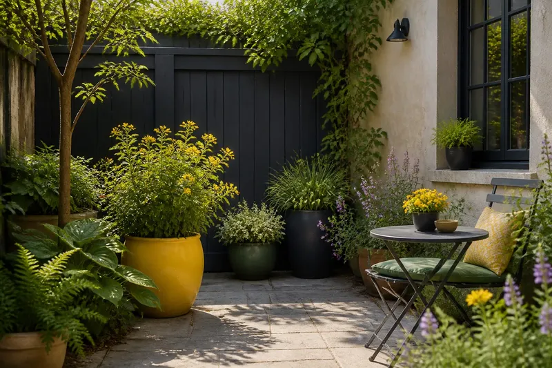
Say you have a small courtyard with pale stone paving, a charcoal-painted fence, and a bright yellow pot you want to keep. You choose charcoal as the anchor, soft green as the supporting color, and yellow as the accent. You could then use leafy plants to carry the green, select flowers with restrained yellow notes, and let the single pot remain the clearest accent. The expected visible effect is a connected planting with one deliberate bright point, rather than several unrelated objects competing for attention.
What can you do across one week?
Use the fourth day to check the plants’ needs before adding them to the color plan. Compare their light, moisture, and mature spread with the courtyard’s actual conditions. A beautiful color choice is not a good fit if the plant needs a brighter spot than the courtyard offers. If the label or grower’s guidance differs from a general suggestion, follow the plant-specific advice.
On the fifth day, make a small composition with movable items: arrange a few pots, color cards, or fabric pieces where they would appear. View the grouping from the door and the seat, then move the accent color away from any spot that feels crowded. This is not a test of the finished garden; it is a low-commitment way to notice whether the colors work together at the scale of the space.
On the sixth day, make a short list of purchases by layer: surface changes, foliage choices, and flowering choices. Keep the list selective. A courtyard can feel busy because of many contrasting leaf patterns, pot finishes, and flower colors, even if each individual item is attractive. You do not need matching containers, a fully coordinated furniture set, or an accent color repeated on every object. That kind of effort can make a garden feel staged rather than lived in.
On the seventh day, review the plan from the views you noted at the beginning. Ask whether the anchor is clear, whether the supporting color appears in enough places to connect the scene, and whether the accent has room to stand out. If one hue dominates unexpectedly, edit before adding more. A pot can be moved, a plant can be placed elsewhere, or a future purchase can be dropped from the list. The palette should help you choose, not force every available spot to be filled.
What questions come up when choosing courtyard colors?
Can green count as one of the three colors?
Yes. Green foliage can be the anchor or supporting color, especially when it occupies much of the view. Remember that plants vary in tone, and consider whether their leaves are glossy, matte, silvered, or variegated.
Do all flowers need to match the palette?
No. The palette is a guide to the strongest visual notes, not a rule that excludes every other flower. If an unplanned bloom feels distracting, move the pot or place it where it is less prominent rather than replacing it automatically.
How do you choose color for a shaded courtyard?
Observe the space at different times and assess the foliage and surfaces there, rather than relying on how colors look in a sunny nursery. Pale flowers, light foliage, or a lighter surface may stand out in shade, while intense colors can appear muted; the effect depends on the space and the plants.
What if a favorite plant brings in another color?
Decide whether that color is a small variation or a new visual focal point. If it is prominent, adjust the supporting or accent color around it, or place the plant where its color reads as a separate moment rather than part of the main grouping.
How do you keep the palette useful as plants change?
Keep a brief note of the three chosen roles and the plants or surfaces carrying them. Revisit it when a plant finishes flowering, a container is replaced, or a new leaf color becomes noticeable. The aim of a small courtyard color palette is not sameness; it is a clear relationship among the colors that take up the most visual space. Let seasonal flowers vary, and let foliage do some of the quiet work between them.
Before buying a replacement or adding a new pot, hold its color reference beside the surface it will sit against and look from the usual doorway. That final glance is often enough to reveal whether the new shade strengthens the courtyard’s palette or asks it to become a different garden.